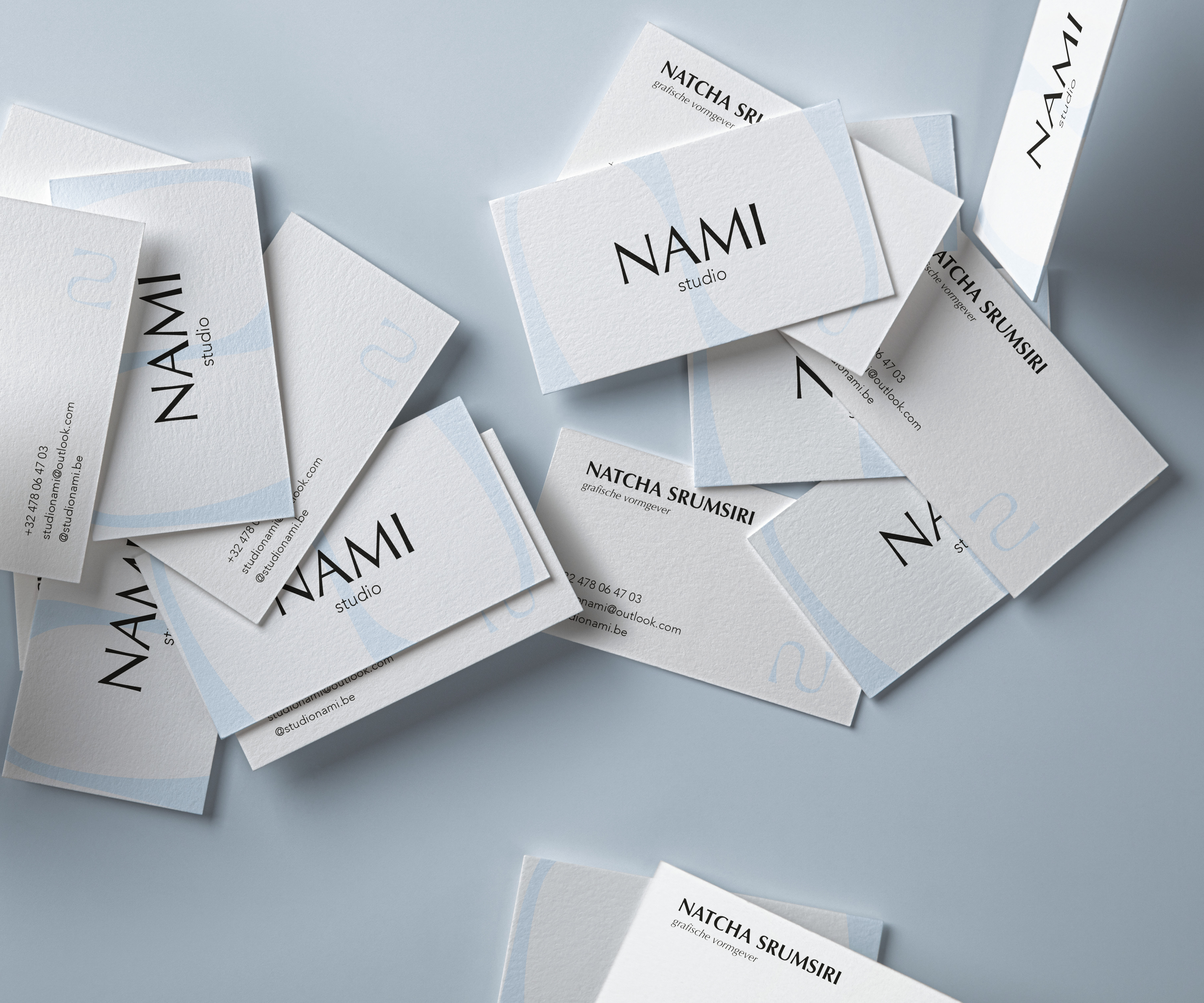
Studio Nami embodies a minimalist and refined visual identity. Each
design, from business cards to digital platforms, radiates simplicity, elegance, and consistency. With a subtle
color palette and thoughtful design, professionalism and creativity merge into a strong personal brand.
The name 'Nami' — Japanese for 'wave' — reflects the studio’s core values:
serenity, calmness, and freshness. It symbolizes natural movement and balance, elements that flow through every
creation. The letter 'N' not only represents my initial, but when flipped and mirrored, it subtly forms an 'S',
capturing the dynamic, fluid character of my work. Studio Nami crafts visual identities that feel powerful yet
harmonious, contemporary yet timeless.